


iControl: Easy Widgets Themes
4.7959.00 Reviews
App Specs
- Version
- 1.7.9.0915
- Updated On
- License
- Free
- Downloads
- 10,000,000+
- Developer
- Fancy keyboard for theme apps
- Categories
- Personalization
- Platform
- Android
Screenshots
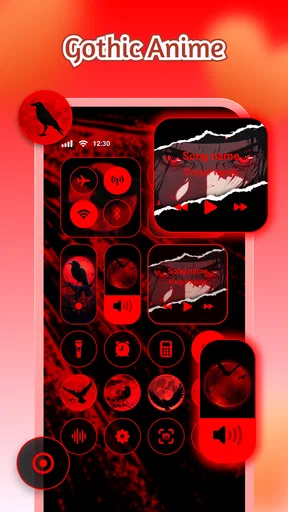
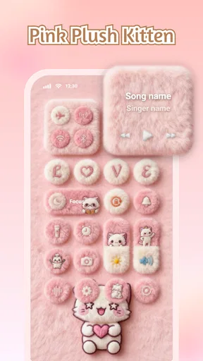
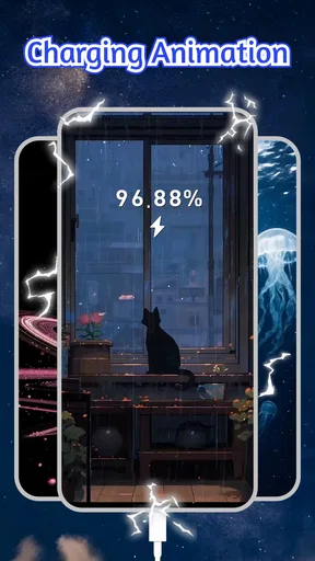
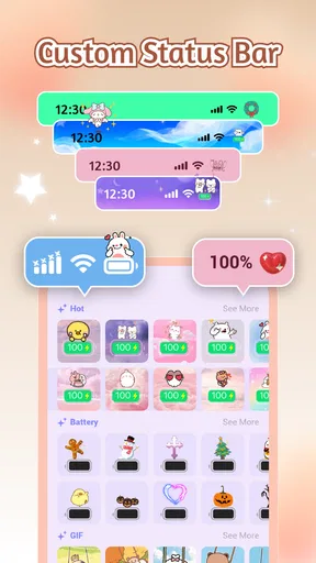
 Analysis by AppCompare
If this is your first time changing a phone’s look, it helps to know what you’re getting into: iControl: Easy Widgets Themes is a personalization app built around a coordinated visual makeover, rather than a replacement for your phone’s entire interface. Its collection brings together control-panel styling, widgets, and fonts, so the appeal is as much about making different parts of the screen feel consistent as it is about finding one attractive clock. I’d consider it when the default home screen feels a little plain, but I wouldn’t expect it to change how every part of the operating system works.
For a newcomer, the simplest goal is not to redesign everything at once. Pick one area you look at often, decide what you want it to do, then see whether a style in the app suits that job. A clock or calendar can make a screen feel more personal while still earning its space; a decorative element you rarely look at may add visual noise instead. That small distinction is useful because customization is most satisfying when appearance and everyday purpose work together.
What to expect from this kind of customization
There’s a difference between choosing a wallpaper and building a visual theme. A wallpaper changes the background, while a setup involving widgets and fonts can affect how information is presented across the screen. The benefit is a more deliberate look; the trade-off is that each extra element needs room and attention. I’d start with a restrained palette and one useful widget, then add more only if the screen remains easy to scan.
The app is free and comes from Fancy keyboard for theme apps. It has a 4.6 average from around 18,000 ratings, with over 10 million installs. Those figures suggest that this style of personalization has broad appeal, but they don’t tell me whether a particular theme will suit your taste. The content rating is Teen, and the app is listed for devices running Android 8.0 or later. Its current version is 1.5.5.1219, and it was released on May 23, 2025.
I’d be most comfortable recommending it to someone who enjoys adjusting colors, typography, and layout, and who is happy to spend a little time testing combinations. If you prefer a completely stock screen, or want a launcher that changes navigation and app organization, this is a different sort of tool. Likewise, anyone who needs a specific widget to behave in a particular way should check that it meets that need before building a whole layout around it.
A calm first setup, rather than a full redesign
After installing, give yourself a minute to look through the available styles before making a choice. Think about the wallpaper and icons already on your phone: a widget that looks good in isolation can clash with the rest of the screen. I find it helpful to choose one visual direction first—such as soft colors or a sharper, high-contrast look—and use that as a filter instead of opening every option and losing track of what I liked.
Then make one change and inspect the home screen in ordinary use. Check whether the text is readable against the background, whether the widget crowds app icons, and whether its information is visible at a glance. This is a more reliable test than judging a preview alone. If something feels busy, remove an element before adding another; the point is to make the screen more pleasant to use, not to fill every available patch.
Worth Reading Before You Choose

Baby Panda World Brings Quick Play to Modern Phones, but Its Game Library Feels Busy

ESPN’s Live Game View Makes Following Close Games Easier

QuizzLand Review: A Good Fit for Short Trivia Breaks, Not Every Player

Basketball Stars: Multiplayer Is Fast, but Can It Recover When Matches Go Wrong?

WEBTOON Turns Phone Updates Into a Better Reading Routine

Link to Windows Runs on Shared Habits, Not Social Feeds
One practical approach is to keep a familiar layout while experimenting with a single widget or font choice. That gives you an easy way back to a comfortable arrangement if the new look proves distracting. It also makes it clearer which change helped. People who alter several visual details at once may like the dramatic result, but they can have a harder time working out why a screen now feels less legible.
Your first useful result: a screen that answers a small need
A good first success might be a home screen where the time and a calendar view are easy to spot without opening another app. If you often check the weather before leaving, a glanceable weather element could be a more useful starting point, provided the option you choose displays the information you care about. The test is simple: after setting it up, can you get the answer you wanted more comfortably than before? If yes, the visual change is doing a real job, not merely decorating the screen.
Picture a weekday morning when you’re getting ready and checking what the day holds. A tidy layout with the time and a relevant schedule or weather detail can reduce a few small interruptions. I’d keep the most important item close to where my eyes naturally land and avoid surrounding it with several competing widgets. That arrangement is not necessarily the most elaborate one, but it is more likely to remain useful after the novelty of a new theme wears off.
There’s also a useful trade-off between a matching look and at-a-glance clarity. A decorative font may suit a theme but become tiring for information you read repeatedly. I’d reserve expressive styling for elements where it doesn’t hinder quick reading, and favor a clear typeface for details I rely on. Personalization works best when it makes the phone feel like yours without making routine checks slower.
A Splash of Color and Creativity
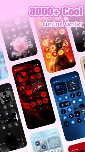
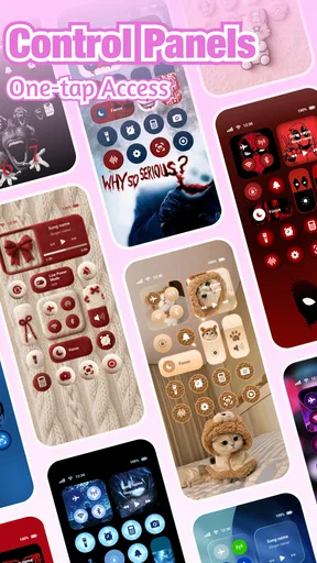
When I first opened iControl: Easy Widgets Themes, I was greeted by a colorful array of themes and widgets. It felt like I’d walked into a candy store, with so many delicious options to choose from. The app offers a vast selection of widgets, ranging from clocks and calendars to weather updates and fitness trackers. Each one is stylish and customizable, allowing you to tweak colors, fonts, and sizes. It’s like giving your phone a personality makeover!
Setting Up is a Breeze
Installing and setting up the app was straightforward. You don't need a degree in rocket science to get started—just a few taps and you're good to go. The interface is user-friendly, guiding you through the customization process with ease. I found myself playing around with different themes, mixing and matching until I found the perfect setup that spoke to my aesthetic.
Why I’m Loving It
One of the standout features for me is the ability to create a truly personalized home screen. With iControl, it’s not just about slapping a widget on your screen; it’s about crafting a look that’s uniquely yours. The themes are regularly updated, ensuring there's always something new to try out. Plus, the app is lightweight, so it doesn’t bog down your device.
iControl: Easy Widgets Themes also integrates smoothly with other apps, pulling in relevant data without a hitch. Whether you want to keep track of your daily steps or get the latest weather updates, everything is just a glance away.
Making the style work day to day
Once the first arrangement looks right, I’d treat it as a practical layout rather than a finished collage. Put the information you check most often where it is easiest to notice, and keep less important decoration away from the central area. If a theme uses several visual accents, repeat only one or two of them elsewhere; matching every detail can make the screen feel overworked. A small amount of restraint often makes the custom elements stand out more.
For someone who likes to change their phone’s look with the seasons or their mood, the appeal is having several parts to experiment with in one personalization app. I would still make changes in stages: adjust a widget, use the phone normally, then decide whether a font or another theme element adds anything. This makes it easier to keep the parts that are genuinely helpful and discard the ones that looked better in a preview than they do during a busy day.
Where the approach can feel less convenient
Custom widgets and themed typography are not automatically better than the standard options already on a phone. A built-in widget may be the better choice if you value a familiar layout, quick access to a specific system function, or the most straightforward setup. A wallpaper app is simpler if all you want is a new background, while a launcher is more appropriate if you want to reorganize app pages or change broader navigation habits. This app makes most sense when visual coordination is the goal.
There can also be a little trial and error between selecting a style and deciding it works in context. Screen space, wallpaper contrast, and personal reading preferences all affect the result. I wouldn’t assume that a large widget is useful just because it displays more; it may take space away from the apps you tap every day. Before settling on a layout, consider what you are willing to give up to make room for it.
If you share a device or rely on a very consistent work setup, frequent visual changes may be more distraction than pleasure. In that case, I’d choose one restrained design and leave it alone, or stick with the phone’s standard appearance. The same goes for anyone seeking extensive controls over system behavior: a visual theme collection should not be mistaken for a full device-management tool.
Who will enjoy it, and who may prefer another option
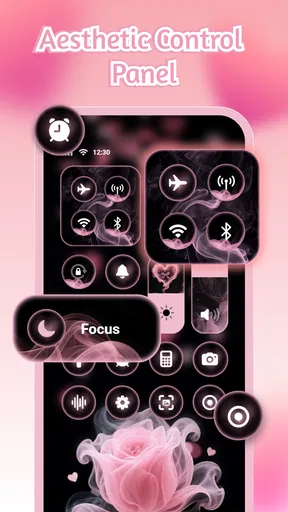
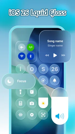
I think the strongest fit is a first-time customizer who wants to make a phone feel less generic without beginning with a complicated redesign. It also suits people who enjoy making a few deliberate choices—colors, type, and a useful widget—and then seeing those choices together on the home screen. The collection’s combination of control-panel styling, widgets, and fonts gives that experimentation a broader visual scope than changing wallpaper alone.
I’d skip it if your main aim is to improve a particular phone function rather than change the look, or if you dislike spending time comparing styles. Someone who wants only a clean, minimal screen may find the default setup already does the job. And if you need one exact feature for work or accessibility, choose the tool that reliably provides that function first; cosmetic flexibility is not a substitute for a must-have capability.
When deciding whether to keep using it, ask yourself two things after the initial setup: do I still notice and use the widget, and is the screen easier or more enjoyable to look at? If the answer to both is yes, the customization has earned its place. If not, there is no need to keep adding elements just because they are available. A pared-back result is still a successful personalization.
Final Thoughts
At the end of the day, iControl: Easy Widgets Themes is a must-have for anyone looking to personalize their phone’s home screen without the hassle. It combines functionality with aesthetics, making it a perfect tool for expressing your style. If you’re like me and love to keep your device looking fresh and exciting, give iControl a try. It’s the little tweaks that make a big difference, and this app delivers just that.
So, if you're ready to take your phone’s appearance to the next level, check out iControl. It’s more than just an app; it’s your gateway to a more vibrant and personalized digital experience.
Pros
- Highly customizable widget options.
- User-friendly interface for beginners.
- Smooth integration with other apps.
- Regular updates enhance functionality.
- Minimal impact on device performance.
Cons
- Limited free themes available.
- Occasional glitches while customizing.
- In-app purchases can be pricey.
- Some widgets lack advanced features.
- Requires permission access frequently.
FAQs for iControl: Easy Widgets Themes
What features does iControl: Easy Widgets Themes offer?
iControl: Easy Widgets Themes provides a variety of customization tools for your device's home screen, including widgets, themes, and icon packs. Users can personalize their interface with unique designs, color schemes, and layouts to suit their style. The app also supports interactive widgets for enhanced functionality.
Is iControl: Easy Widgets Themes compatible with all devices?
iControl: Easy Widgets Themes is designed for both Android and iOS devices. However, compatibility may vary based on the operating system version. It's recommended to check the app's requirements on the download page to ensure it works smoothly on your specific device model.
Does iControl: Easy Widgets Themes require a subscription?
The app offers both free and premium features. While basic customization options are available at no cost, a subscription unlocks advanced themes and widgets. Users can choose a monthly or annual plan depending on their preference for additional customization capabilities.
How user-friendly is iControl: Easy Widgets Themes for beginners?
iControl: Easy Widgets Themes is designed with an intuitive interface, making it accessible for users of all skill levels. The app includes a tutorial guide and tips for beginners to help them get started with customizing their home screen with ease and confidence.
Can I share my custom themes with others using iControl?
Yes, iControl allows users to share their custom themes and widget designs with friends and the community. This feature encourages creativity and interaction, enabling users to showcase their unique styles and download themes created by others for a diverse customization experience.


